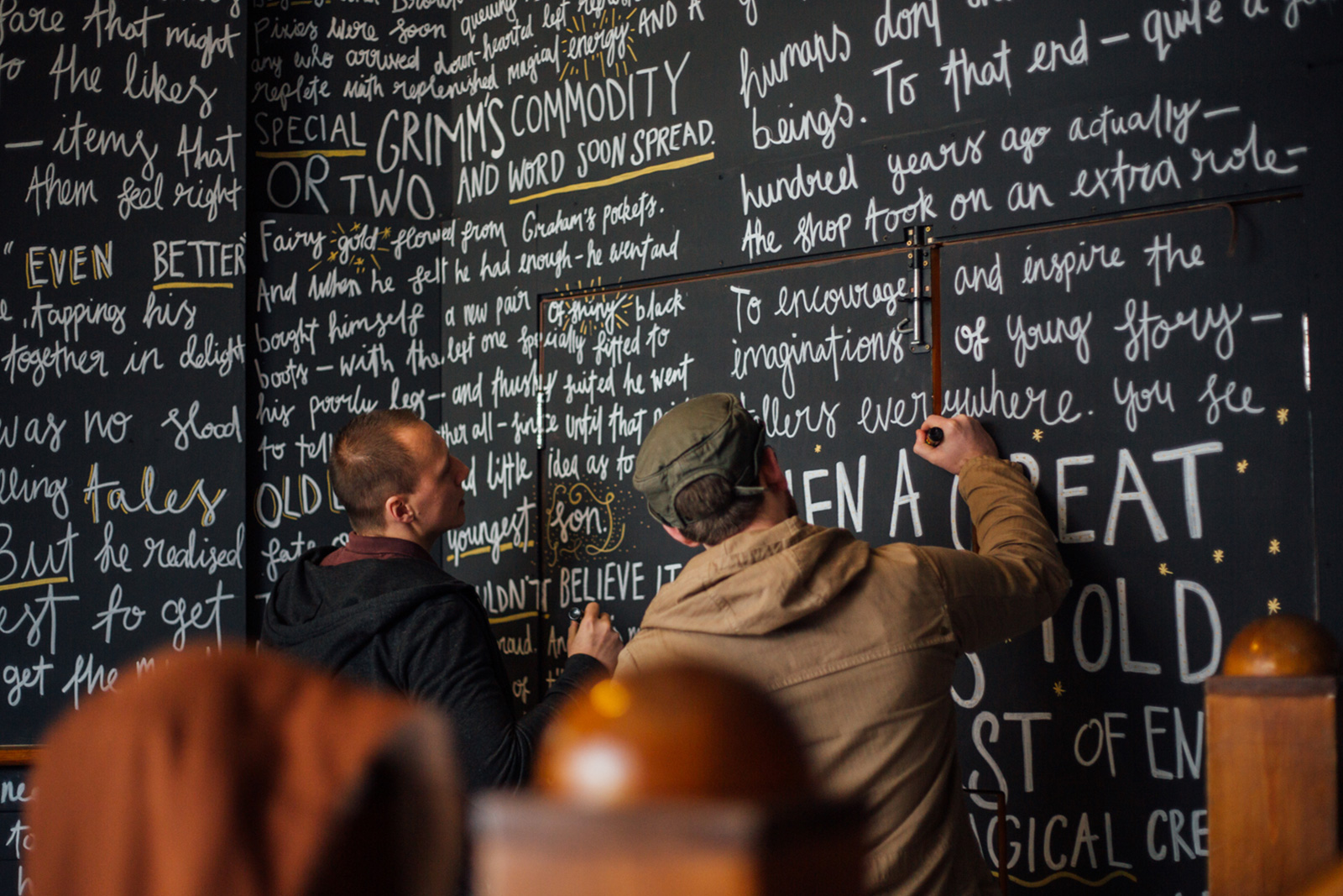
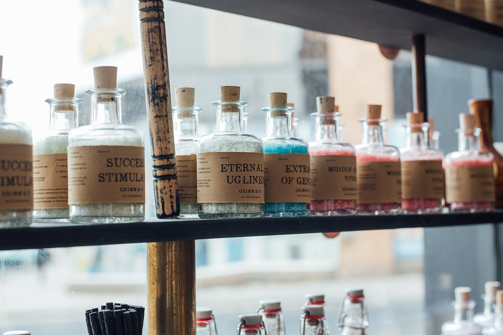
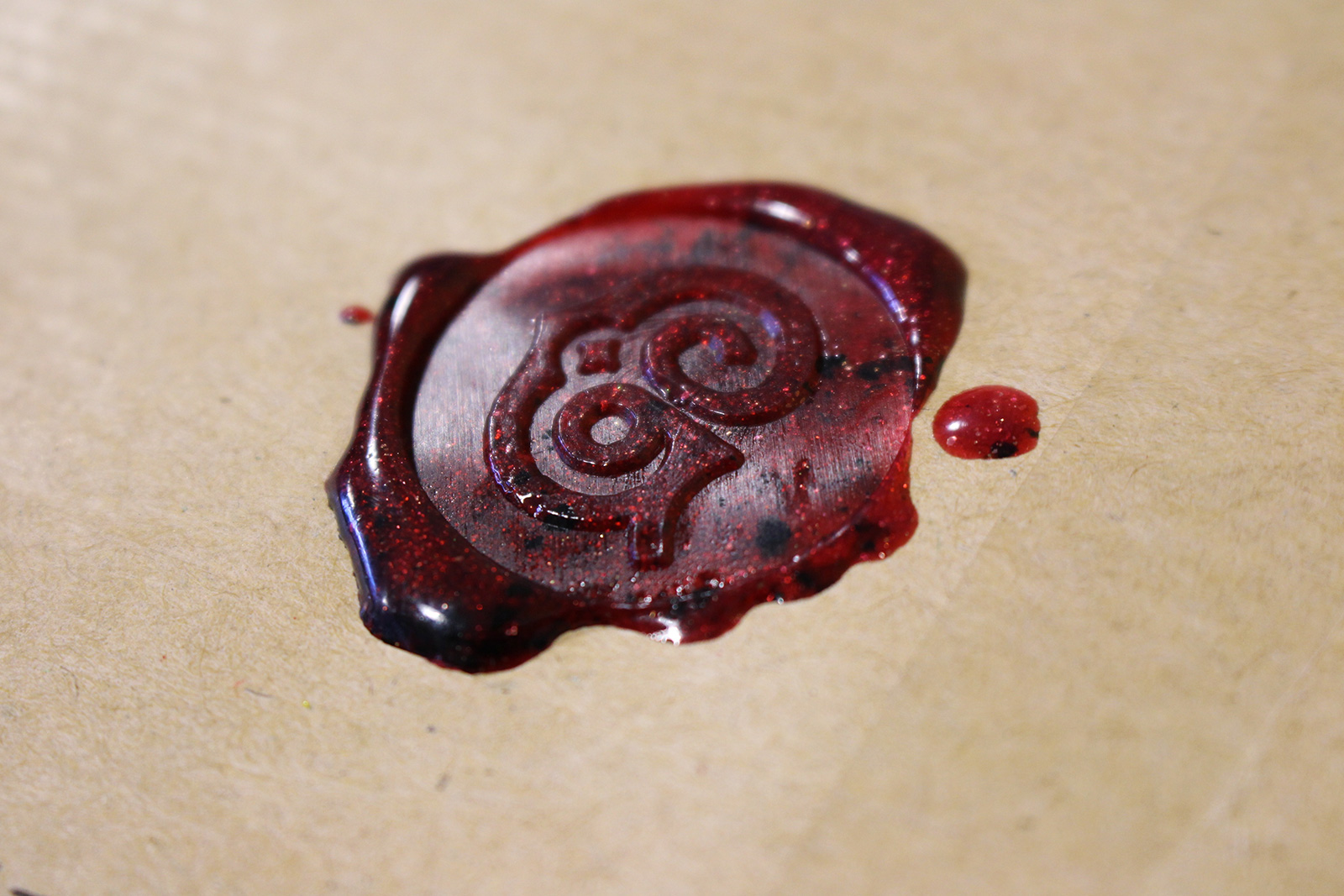
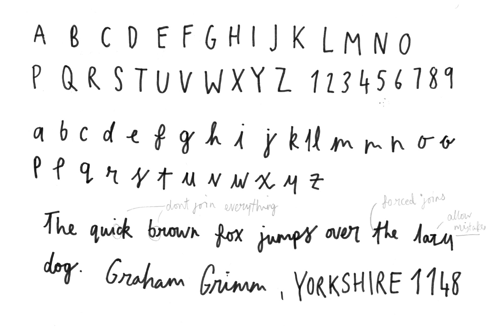
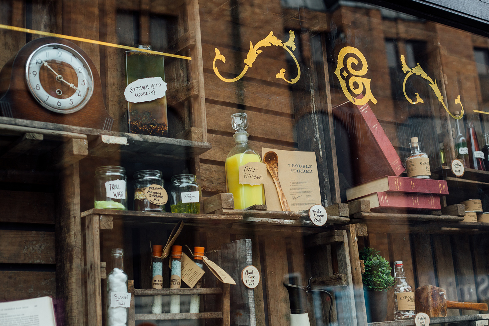
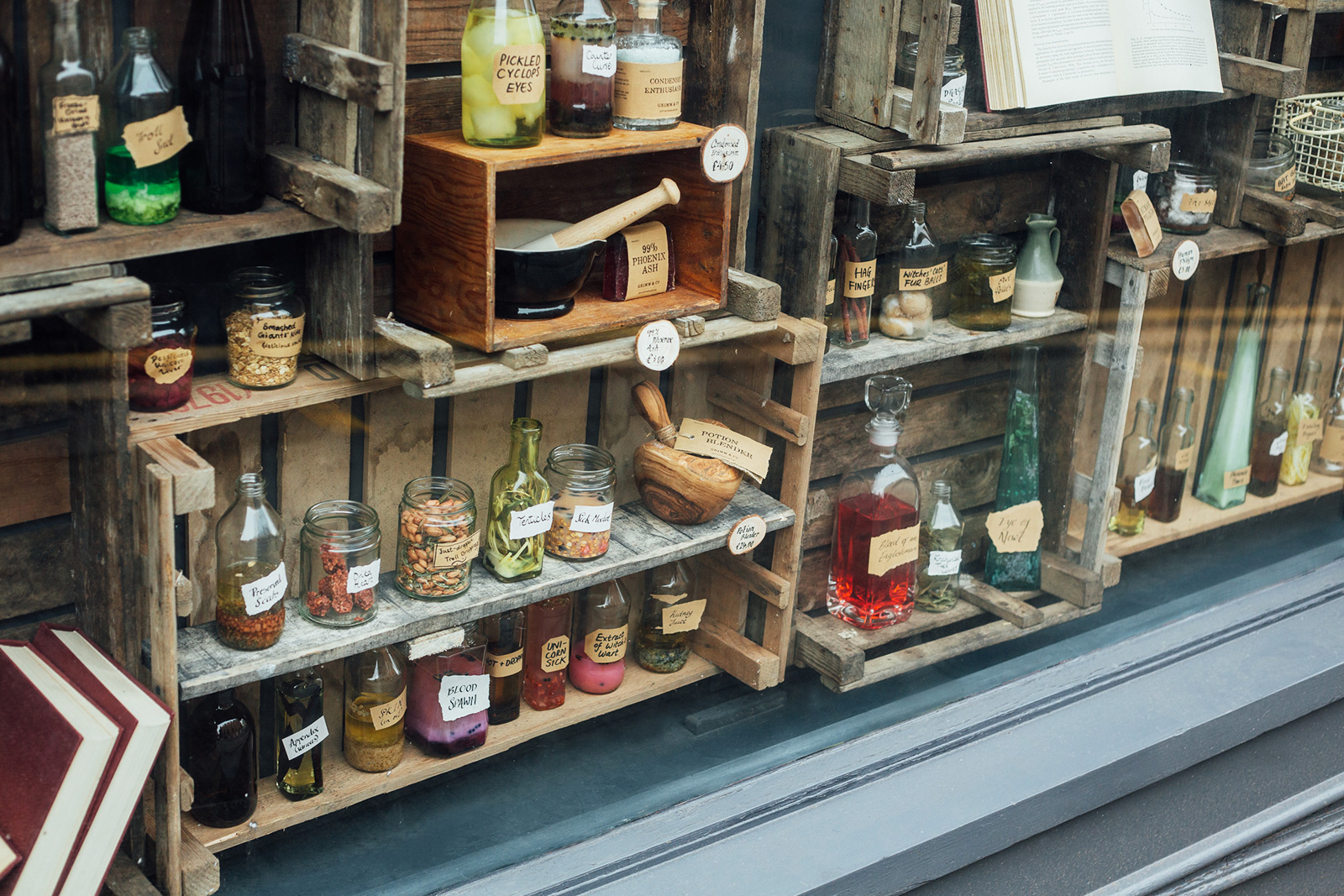
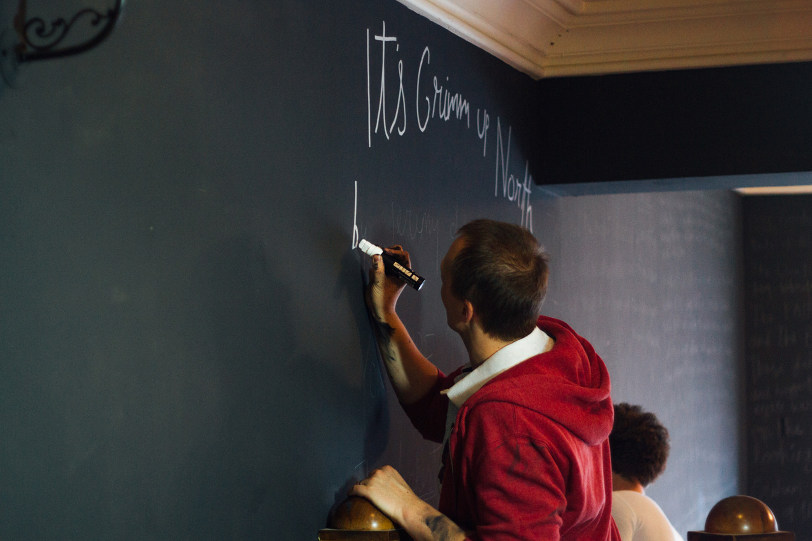
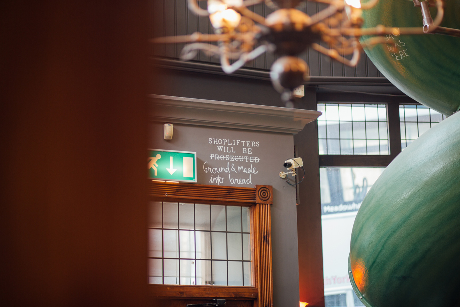
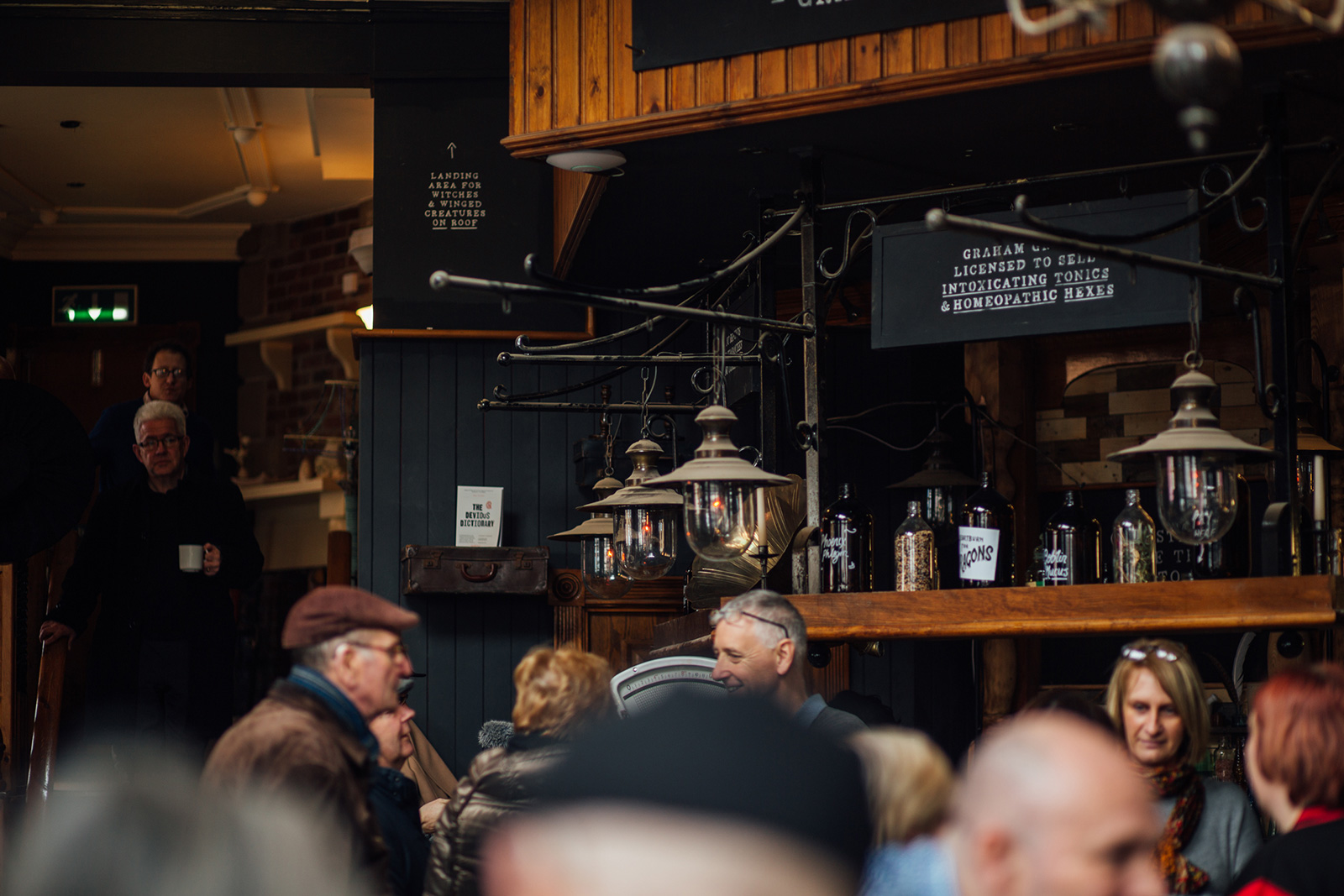
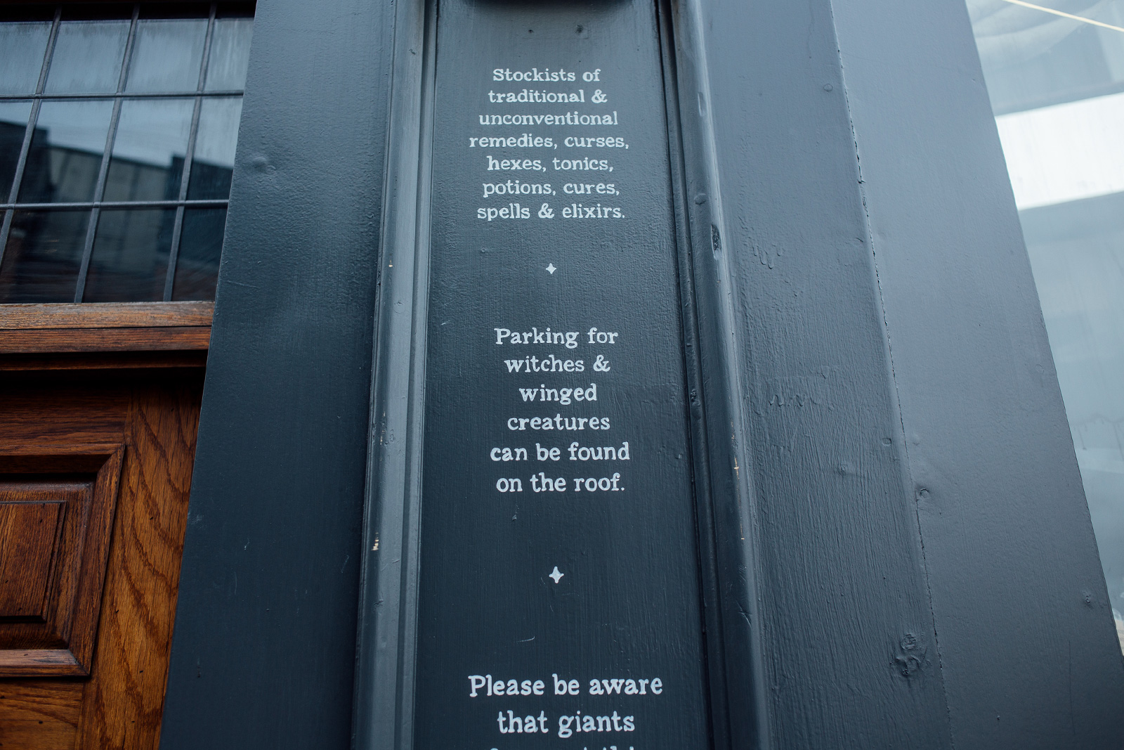
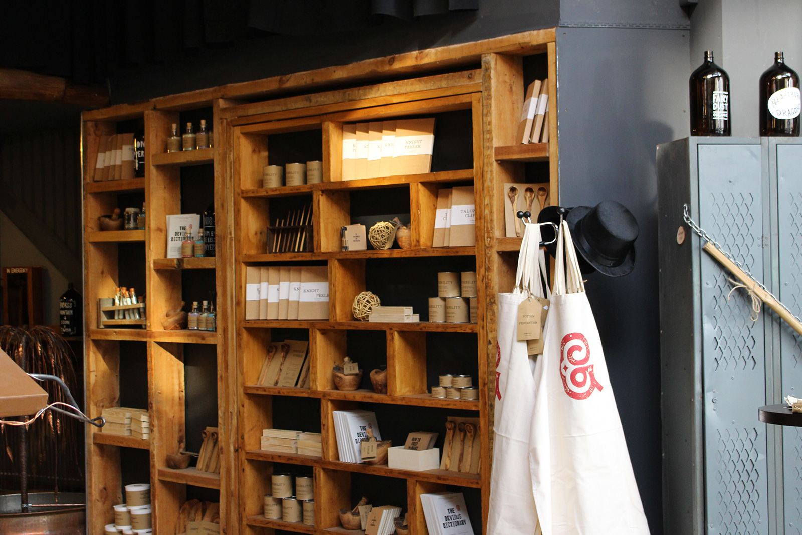
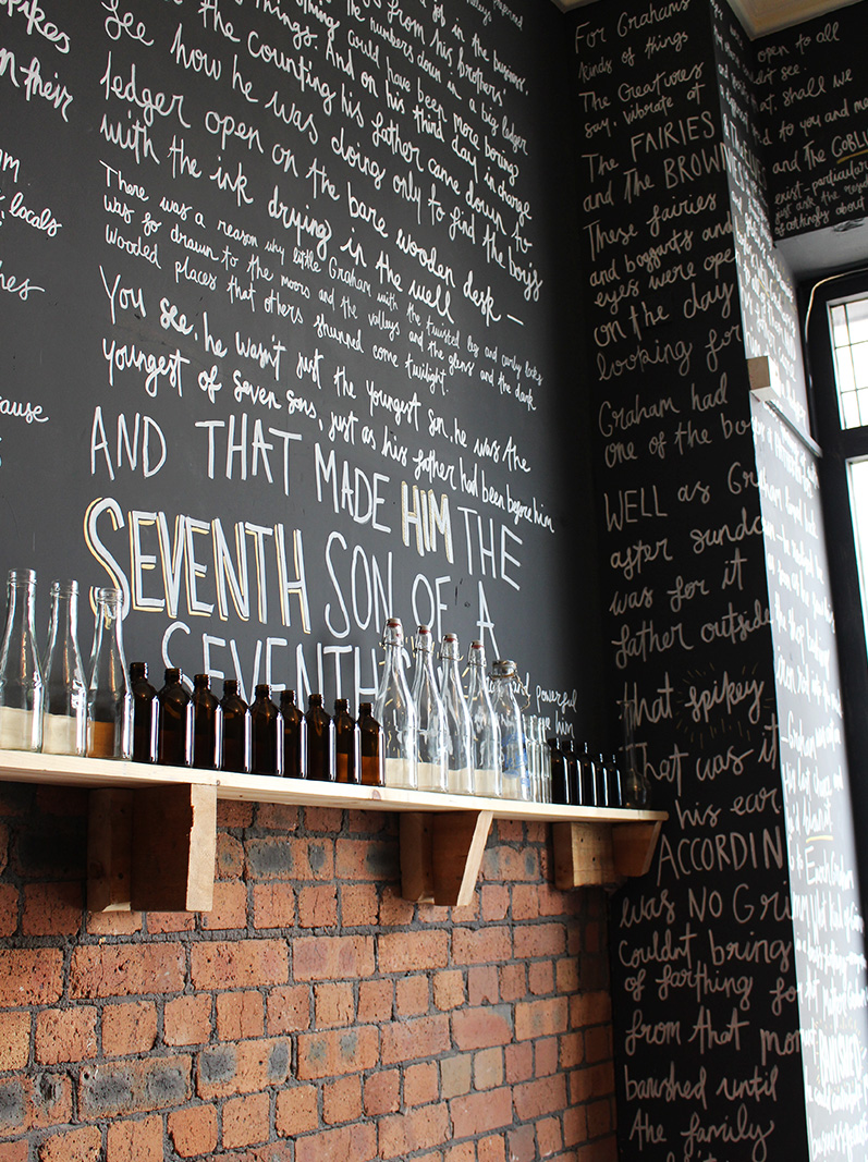
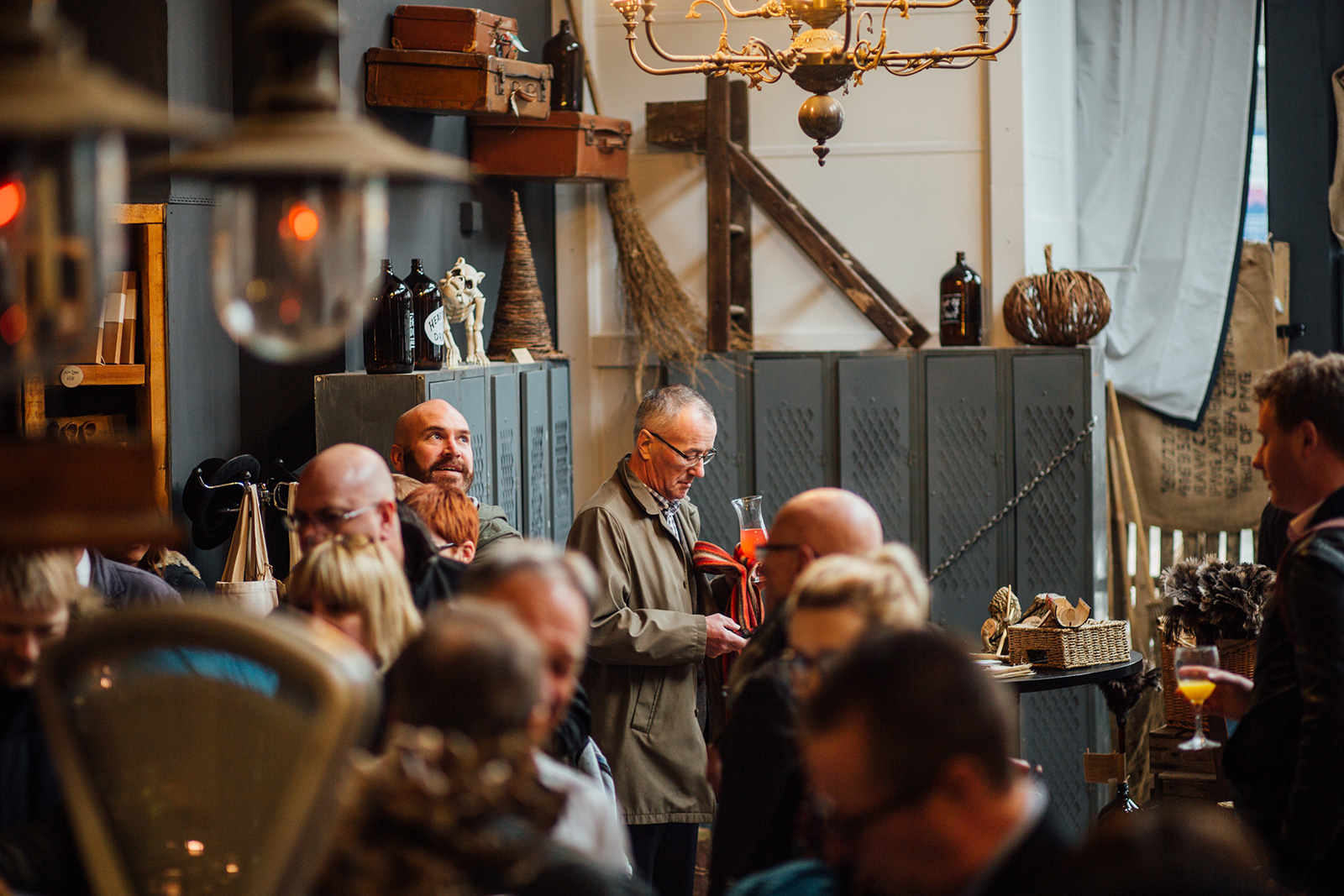
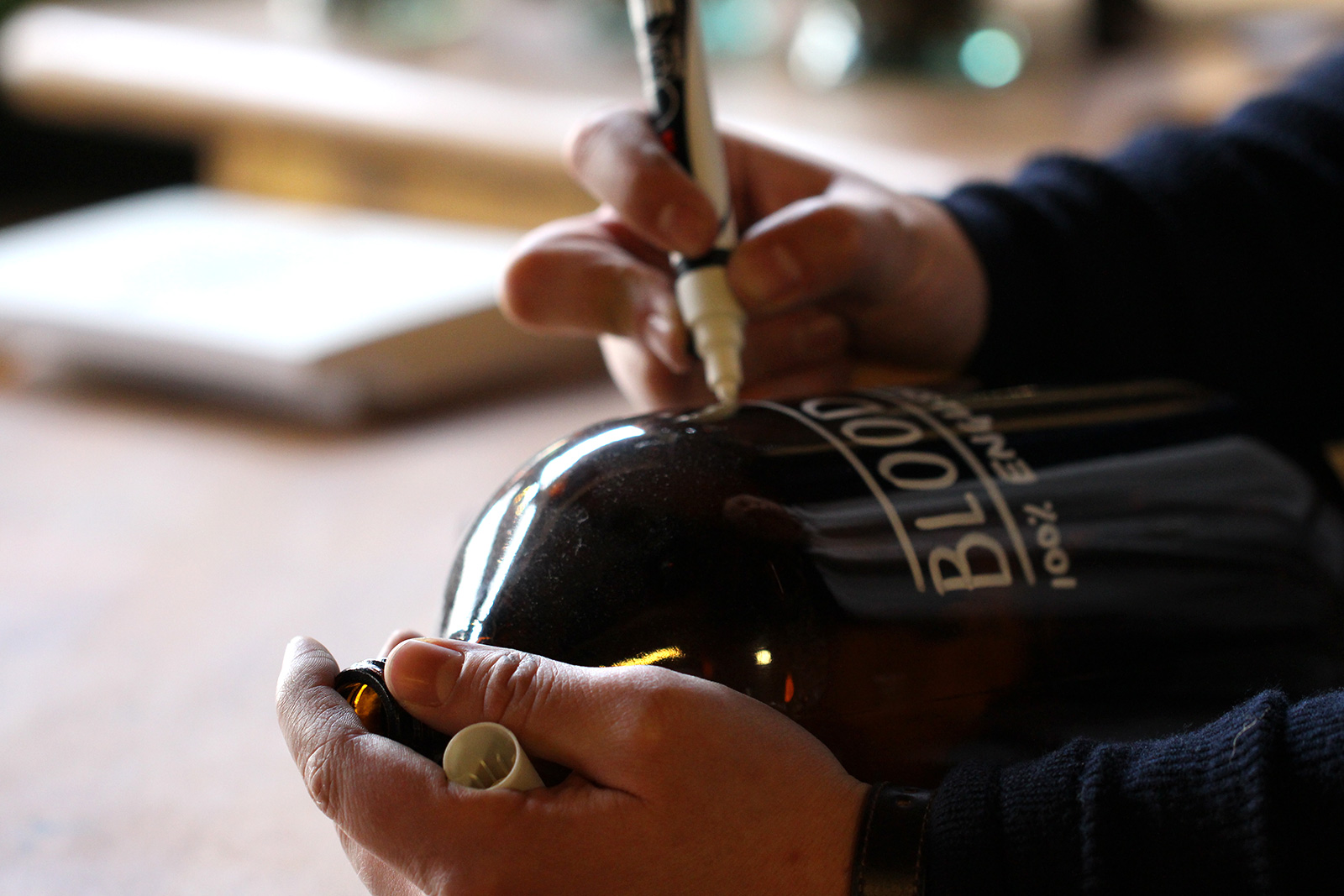
This Grimm & Co branding has to be my favourite brand example this year. I LOVE stuff like this and it’s exactly the sort of project I dream about; full immersion in the brand creation. This is a beautiful example of getting VERY clear on who the brand is and who it is aimed at. Once you get intimate with these two things you can create magic like Side By Side did with this project. The photos speak for themselves I think. As you look through, be sure to really ‘see’ how the brand is in the heart of EVERYTHING, from the copywriting to the design, the fixtures and fittings to the products on sale. The clarity of identity that the team have created is fantastic. Enjoy! 🙂


Grimm-Shop-Frontsidebyside_grimmandco_immaginationroomtype

sidebyside_grimmandco_charms

sidebyside_grimmandco_eternaluglinesssidebyside_grimmandco_immaginationroomsidebyside_grimmandco_mark

sidebyside_grimmandco_soapssidebyside_grimmandco_staffsignsidebyside_grimmandco_talonclipperssidebyside_grimmandco_troublestirersidebyside_grimmandco_typesidebyside_grimmandco_windowdesignsidebyside_grimmandco_windowprops-1sidebyside_mural_lukesidebyside_mural_oliversidebyside_shoplifters

sidebyside_grimmandco_counterportrait-1-1sidebyside_grimmandco_countershot

sidebyside_grimmandco_noticeboard-2sidebyside_grimmandco_slidesidebyside_grimmandco_outsidewarningssidebyside_grimmandco_potionblender-1sidebyside_grimmandco_school_productssidebyside_grimmandco_school_products2sidebyside_grimmandco_secretdoorsidebyside_grimmandco_giantbellybuttoncleanersidebyside_grimmandco_grandmasscabssidebyside_grimmandco_immaginationroom-1sidebyside_grimmandco_launch

sidebyside_grimmandco_bottle